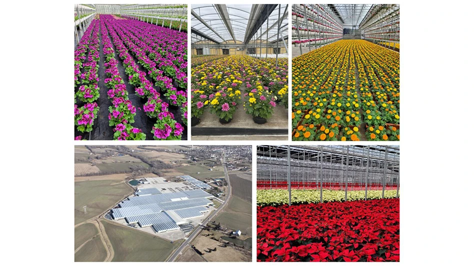
How many of us have had this encounter at our garden center? A customer is on their phone telling a friend about the cool place they are at and turn to us and ask, “What’s the name of this place?”
It can be frustrating, especially when we’ve worked so hard to create an exciting environment. Establishing trust and recognition by creating a statement wall may be the answer.
A statement wall can set the tone for a customer’s visit, define your store’s aesthetic and promote the brand. An effective statement wall should be in a high-traffic area near the entrance so customers see it immediately and get a lasting impression from it.
It should speak to your target audience and convey your brand’s values. It can be simply a painted wall with your logo and tagline, or it can be elaborate and incorporate materials that flow with your overall design and fixturing.
In larger stores, several statement walls may be needed, with some available as photo opportunities to incorporate our brand into people’s memories with friends and family. They should make a lasting impression and set the tone for the customer’s experience.
Here are a few examples from recent trips to garden centers.
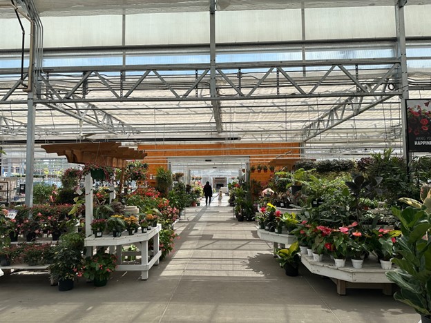
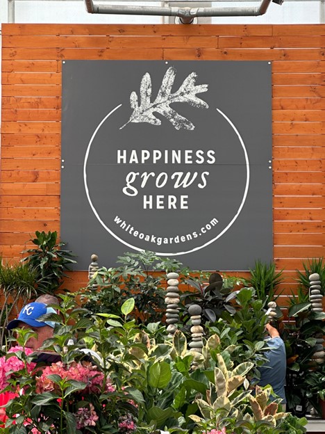
At White Oak Gardens in Cincinnati, Ohio, I was impressed not only by the statement wall in its greenhouse, but by what I can only refer to as the tease on the way to it. The wood-framed entry into the greenhouse already made me feel like I was headed somewhere wonderful.
It stood out against the surrounding glass and magnetically pulled me through. After passing through it, I turned right and was hit by this impressive wall. Not only did I smile, but I felt like, “Yeah, this is my place!”
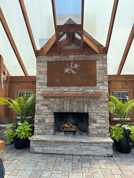
Outside, a grand pergola with a fireplace completed the experience.
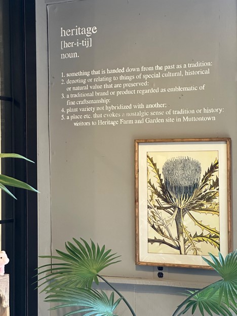
Heritage Farm & Garden in Muttontown, New York, is a stunning garden center on Long Island. It welcomes visitors with massive planters lining a long drive, but its statement comes first with a vintage truck near its outside entrance. It immediately conjures a sense of history and richness of the area.
Upon entering the store, another statement is presented. This time, we are greeted with a brilliant definition of “heritage” that includes customers. They are welcomed as more than guests, but as family.

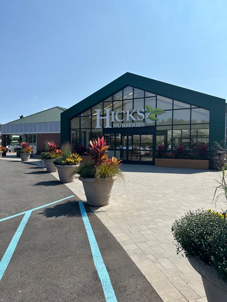
Hicks Nurseries in Westbury, New York, has been a family tradition on Long Island since 1853. With such provenance, one might think Hicks can just open its doors and draw upon its history.
But Hicks is one of the most innovative garden centers in our industry and is forever reinventing itself and improving. Its recent entrance makeover alone is a statement. One knows exactly where they are when passing through it. And inside, Hicks is masterful at reminding its customers where they are. (Editor's note: Garden Center magazine is publishing a three-part series on Hicks Nurseries' store redesign this month, so stay tuned for more!
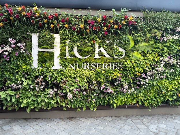
Statement walls have tremendous impact on customer experience by immersing and engaging them. They make shopping memorable and foster loyalty.
Erik Dietl-Friedli has worked in retail gardening for 35 years and is currently the head buyer at Flamingo Road Nursery in Davie, Florida. He began his career at Martin Viette Nurseries and Hicks Nurseries on Long Island focusing on buying, visual merchandising, developing seasonal events and creating dynamic product programs. He and fellow industry veteran David Williams recently launched Garden Center Consultants.
Latest from Garden Center
- GIE Media Horticulture Group wins five regional 2025 Azbee Awards of Excellence
- Terra Nova Nurseries introduces rust-free and disease-resistant heucherella
- John T. Nickel, founder of Greenleaf Nursery Co., passes away at 89
- Garden Media Group announces sixth annual Women in Horticulture Week
- Star Roses and Plants announces National Knock Out Rose Day
- The Growth Industry Episode 4: How federal budget cuts are affecting horticulture nonprofits
- Pennsylvania Horticultural Society shares top gardening trends from 2025 Philadelphia Flower Show
- California Spring Trials 2026 dates announced

