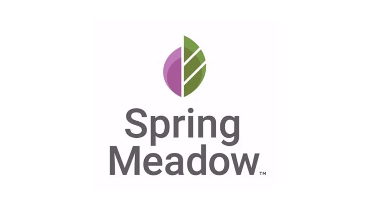
December 4 marks the release of Spring Meadow Nursery's bold, new logo - the first logo update in a decade and the most dramatic change in company branding since Deppe family started the business in 1981.
The previous logo consisted of a sprig of three green leaves which represented Spring Meadow Nursery’s shrub propagation heritage. This is still reflected in the leaf of the new design, however, the addition of a colorful flower bud expresses a dedication to the development and introduction of new, colorful, flowering shrub genetics.
The streamlined presentation also edits out the words “Nursery Inc.” from the branding, reinforcing a reach that extends far beyond nursery work. A state-of-the-art facility, Spring Meadow Nursery currently has over 34 acres of greenhouses and research facilities, allowing the propagation of exponentially larger and more vigorous lines, and the expansion of plant genetics and development programs for the Proven Winners ColorChoice brand. With a focus on innovation, Spring Meadow Nursery searches the world for new plant varieties has become a leader in plant genetics and propagation for the Proven Winners ColorChoice brand of shrubs.
“What we do at Spring Meadow has been continuously evolving to meet the needs of our customers and bring new plant varieties to the market.” said product development and marketing manager, Tim Wood. “We felt a need for our identity to match that evolution and this new logo does that.”
With the last logo update having occurred 10 years ago, it was time to create a redesign that was cross-platform marketing-friendly and better reflected Spring Meadow Nursery’s work in the industry. The new logo reflects the strength and direction of Spring Meadow Nursery and the Proven Winners ColorChoice line.
Look for the new Spring Meadow logo in our booth at MANTS in Baltimore in January and watch for a new website launch in the upcoming months.
Latest from Garden Center
- America in Bloom announces 2026 program launch and celebrates 25 years of growing vibrant communities
- AmericanHort launches HortCred to advance skills development in the green industry
- Oasis Grower Solutions announces new northeast territory sales manager
- Amanda Solliday named senior manager of Sustainabloom
- New McCarthy-Family Flowers Legacy Fund supports multi-generational retail florists
- Monrovia releases new retail program, Landscape Legends, to mark 100th anniversary
- USDA to conduct 2025 Organic Survey
- Save the date for the 78th Santa Barbara International Orchid Show


