Since 2000, the Pantone Color Institute has designated a color of the year based on trend forecasting across a variety of industries and markets, including fashion, travel and housing. For the past 15 years, they’ve selected one hue, but for 2016, the color experts have broken their own mold and announced two shades as the collective PANTONE Color of the Year, and a specific plant was part of the inspiration.
Soft tones Rose Quartz and Serenity, reminiscent of the light pink and light blue hues used in boy and girl baby announcements, clothes and other items historically used to designate the genders, are expected to make waves this year. The color trend announcement can impact everything from nail polish to clothing to living room wall paint, and this year, Pantone said it wanted calm, soothing colors to combat stress and anxiety and promote a sense of well-being.
Photo credits: Mug, PANTONE Universe. Hydrangea, Thinkstock.com
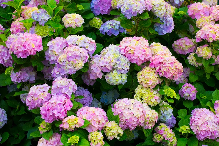
Initial inspiration for the sky-blue and cotton-candy-pink shades may have come from a naturally peaceful space -- a garden. In an interview with American Public Media’s Marketplace, Leatrice Eiseman, executive director of the Pantone Color Institute, pointed out the blending of faded pink and blue hues on a hydrangea plant in her garden when talking about how they determined the Color of the Year.
“‘Hydrangeas, I think, are sometimes more beautiful when they’ve died than when they’re alive,’ Eiseman said – pointing out shades of pink and blue that still tinge the blossoms — the colors, as it turns out, that she and her team picked for 2016," Marketplace reported.
The goal of the color selection was not to reinforce color stereotypes within genders, but blend and challenge them, according to Pantone.
“In many parts of the world we are experiencing a gender blur as it relates to fashion, which has in turn impacted color trends throughout all other areas of design,” according to Pantone’s press release about the announcement. “This more unilateral approach to color is coinciding with societal movements toward gender equality and fluidity, the consumer's increased comfort with using color as a form of expression, a generation that has less concern about being typecast or judged and an open exchange of digital information that has opened our eyes to different approaches to color usage.”
These tones are also more muted than some of the hues Pantone has selected recently, perhaps signaling a return to the popularity of softer shades of annuals and pastel-colored plants that some breeders noted during California Spring Trials.
Plant breeders have begun to suggest their plants as a way to embody and embrace the 2016 Pantone colors, such as this MixMasters Pink Outside The Box from Ball FloraPlant. Photo credit: Ball Horticultural
How are you using the Pantone colors at your garden center? Leave a comment or send an email to msimakis@gie.net and let us know.
Latest from Garden Center
- Terra Nova releases new echinacea variety, 'Fringe Festival'
- Sakata Seed America celebrates renovation of Cal Poly greenhouse complex
- American Horticultural Society names winners of 2025 AHS Book Awards
- American Horticultural Society announces winners of 2025 Great American Gardeners Awards
- NewGen Boxwood added to Proven Winners ColorChoice line
- Ask HR: We got a bad review after an employee having a bad day snapped at a customer. What do I do?
- How to cultivate connections with vendors
- The Growth Industry Episode 3: Across the Pond with Neville Stein


