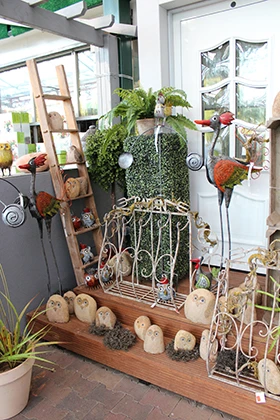
 In September, I had the opportunity to visit Dinger’s Gartencenter, a single location independent garden center in Cologne, Germany. Owner Christian Dinger told me that customers travel from 150 to 200 kilometers (approximately 93 to 125 miles) away to come shop at the store, which celebrated its 50 year anniversary in 2010. As I looked around the store, it was obvious why they make the trip: excellent curb appeal, great cross-merchandising and use of vertical space, and high-quality, well-displayed green goods. Over the next few pages we’ll let the photos do most of the talking and share some of the best merchandising we saw that you can adapt for your own store.
Curb to cash register
But what does merchandising matter if customers aren’t intrigued enough by your store’s curb appeal to venture in? The first thing customers will notice as they approach Dinger’s is the beautiful, landscaped exterior of the building as well as large signs welcoming customers in at the entrance and, after their visit, thanking them for shopping at the exit. All signage is easy to read and color-coordinates with the building and logo. The garden center is very accessible and is about 15 minutes outside of Cologne proper. It’s on a main road and even has its own traffic light at the entrance/exit. The road was busy on Thursday morning when we arrived, and it’s likely that customers unfamiliar with the garden center would consider stopping in and parking in one of the 300 available parking spaces.
Mixing it up
One of the areas where Dinger’s excelled was in their cross-merchandising. No matter if customers walk through the hard goods or the green goods section, they’ll see items from both categories. One of the display elements that I saw repeated quite often was grouping decorative plant stakes and other complementary accessories into a container in the center of plant benches (1). Plants were also grouped with tall plants in the center, “filler” plants around them, and trailing plants right at the edge. (2) Customers could essentially pick a plant from each part of the bench to create an easy container combo. Some benches also had plant food at the end of the bench (3). Talk about a one-stop shop!
There were also displays in the gifts and décor area at the opposite end of the store that showcased small, magnetic pots and other containers with a small, moveable plant display right in front of them (4). In addition, they placed a few of the plants in the containers to inspire customers. This sort of display was repeated in a similar fashion throughout the hard goods section.

The tall and the short of it
As customers peruse the store, they may not realize just how much product is actually on display, or at least it likely doesn’t seem overwhelming. This is in part due to Dinger’s excellent use of vertical space and varying heights in displays. This technique helps to create visual interest and simplify complex displays with many items. It has employed this technique in all areas of the garden center, including in the outdoor display gardens.

Photos and article by Karen E. Varga

Explore the December 2013 Issue
Check out more from this issue and find your next story to read.
Latest from Garden Center
- This Florida garden center's busiest days are in the fall, not spring. Find out how they do it
- Terra Nova Nurseries releases new agastache variety, 'Peach Pearl'
- The Certified Shopify Online Garden Center provides local retailers with ecommerce tool
- Meet the All-America Selections AAS winners for 2025
- Endless Summer hydrangeas and Suntory Senetti glam up Grammys red carpet
- Ball Seed releases 2025 edition of 'Thrive and Flourish' for landscape and garden retail
- American Floral Endowment's Fred C. Gloeckner Foundation Research Fund accepting grant proposals
- Floral Marketing Fund and CalFlowers partner to advance floral industry


