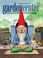
 Tis the season to run around like mad, help customers, ring up purchases, load cars and restock the impatiens bench for the hundredth time! What might get lost in the shuffle are displays and merchandising. Who has time to make things pretty when gardeners are in a buying frenzy?
That’s true. To a point.
The height of spring isn’t the best time to create (and restock) an elaborate display. But it’s at this moment—more than ever—when a clean, orderly appearance is an absolute must. It could mean the difference between cultivating a repeat customer and simply hanging onto a once-yearly “seasonal” buyer.
So, grounded in reality, the team at Garden Center has rounded up a collection of strategies to keep things humming despite the hectic-ness.
Take a deep, cleansing breath and dive in.
The gurus speak.
We start with some words from an industry guru: Rick Holberg, president of Green Branding and Holberg Designs. He encourages garden retailers to focus on the following “merchandising musts.”
Educate with your displays. Younger gardeners usually have little knowledge and need a lot of help at being successful in the garden. Make your displays informative and educational. Include how-to brochures and DIY tips signs. If you can raise their level of confidence you can expect them to be less cautious with their spending.
Create displays of your own “container plant kits.” Put plants, soil, plant food and a how-to-grow brochure in a pot. Give them everything they need to be successful and package it in something easy to pick up and carry through the checkout line. Show an example of the outcome. Price it right and place it near the checkout so it could almost become an impulse purchase.

Position your displays where they’ll do the most good. What’s in your decompression zone (inside the door to the right)? Have you identified your store’s sightlines so customers can see a hot new display from a distance and be drawn to it? What do they pass on the way there? What are your store’s hot spots? Find them and use them to your advantage.
Reduce your SKUs (and raise your bottom line). You’ve heard this one before. How many ways do you need to kill a bug? Or repel a deer? Customers want you to do the research and will expect you to suggest the best solution to their problem. They don’t need six solutions. Just the best one.
Stylish, attractive displays draw and hold more interest. Develop a strong focal point to the display (close to eye-level if possible). Consider multi-levels of product and color blocking. Think about how signage can enhance your store’s visual brand in a display. Remember that balanced asymmetry creates visual interest. If you can get your customers to look longer, they just might buy more.
Cross merchandise in the more-attractive displays. Create a display of multiple items from throughout your store that are all yellow or purple, for example. Or three concurrent displays of the primary colors. Think color continuity and its visual power. You get the idea.
 Display to inspire. Instead of thinking about creating a display to sell plants, think about how to create a display that inspires through lifestyle enhancement. Or through beautifying their life. Inspire customers to think about how this will look in their own homes. Grab them on an emotional level instead of being just product-oriented. Signage and messaging can help get this across.
Read to learn and grow. Pick up a copy of Paco Underhill’s “Why We Buy.” It’s some of the best shopping research I’ve ever read. Great anecdotes explaining a multitude of aspects about “retail shopping science.” He has a host of thoughtful tips you can implement quickly.
Display your store’s brand. Develop a consistent visual approach for everything in your store, not just displays.
Consider logo application, colors and messaging throughout the full retail customer experience. Be consistent in your logo, font, color and messaging. You’ll look more cohesive, professional and stylish. wisdom of the retailer. Now we move on to advice from someone who has faced the spring rush head-on for many years. Ellen Barredo is the horticulture manager at Bowood Farms in St. Louis (www.bowoodfarms.com). She offers these real-world tips:
Educate, ask for ideas and accept change. Empower your staff by teaching them simple principles of display building so they understand the concept. The staff should understand their part in display fill-in and maintenance to avoid the “sold-out look.”
Observe customers. As you study people moving through the nursery, note where they’re drawn to pick up plants/products. These hot spots become focus areas because it’s what they see first when entering your store.
Mix it up, keep it simple and change it often. Don’t go for the gusto in all of your spring displays. Plants and products should be easy to lift and move by any staffer without pulling people from other departments for help. Use smaller trees and shrubs to create backdrops for perennials, annuals, tropicals in displays.
Keep it neat and full. Guests are arriving! Don’t forget to straighten tags in pots and move signs when plants are relocated to another area of the store.
Stay ahead of change outs. Staff should be aware of product delivery dates, product mix and when change outs will be needed. My goal as I buy is to encourage this thinking process, discuss what is needed and implement some of the ideas. This involvement creates ownership.
Ensure adequate quantities. If there’s not enough on hand, it’s tough to build a display or keep it full.
Cleanliness is crucial. When you remove plants from a display, sweep or rake up the debris found below. It seems simple, but it’s a step that’s often skipped.
Sequester the sick. Everyone should develop an eye for sick plants, wilted plants, etc., and remove them ASAP. And don’t forget to fill empty spaces.
Go with the flow.
Yeah. We know. You’re way too busy right now for “big picture” thinking. But garden centers always have to keep traffic flow in mind. The best “quick tips” in the world amount to nothing if your store is impossible to navigate. George Little Management recaps some principles of traffic flow basics in its online Display Handbook (www.glmshows.com/press/DisplayHandbook):
At the entry, introductory displays including graphics welcome and educate the customer. The entry area is often referred to as the “decompression zone,” where the customer makes an adjustment to the new environment and takes visual stock of the entire store. Sales rarely take place in the decompression zone. In fact, most sales take place after the customer passes through this area.
Once your customer passes through the decompression zone they look at the price of the first item, generally to their right, that is easily accessible. This initial item should have a price point that is not overwhelming to your customers, as this area, called the “strike zone,” offers your customer their first impression of your store’s prices. You should consider placing a compelling display of affordable products (in relation to the price point of your overall merchandise) in the strike zone.
One of the most highly trafficked areas is the cash wrap. Add-on and impulse merchandise should be placed above, behind and near the cash wrap where possible. The cash wrap is the location that offers the most captive audience (a waiting customer) and is the point at which impulse sales are most often made.
High-demand products should be placed in the rear of the store. This will pull customers through the store, increasing the visibility of other products along the way.
Reach for the stars with visual ‘bang’
Is there an area or artifact in your store people flock to? An antique truck or rustic shed, for example? Have you gone the extra mile to make it a destination in your garden center? The companies featured in the book “Retail Superstars: Inside the 25 best independent stores in America” all have a visual “big bang” at their epicenter, and play it up to its full advantage. Some examples…
- Jungle Jim’s International Market, Fairfield, Ohio: A full-size rickshaw is situated in the Chinese foods section. Elsewhere, English foods are housed in Sherwood Forest, complete with a talking Robin Hood.
- Gump’s, San Francisco: Upon entering the store, customers are dazzled by a stunning display of jewels.
- Archie McPhee, Seattle: Customers are encouraged to snap pictures with an 8-foot-tall gladiator statue and Captain Archie cutout.
- ABC Carpet & Home, New York: The store’s eco-hub on the third floor exhibits the company’s sustainable products in a museum-like setting, with signage that describes how eco-friendly and sustainable materials are used to construct them.
For an inspirational virtual tour of these stores, visit www.retailsuperstars.com.
Quick take: Bring shelf talkers into the 21st century
Garden centers have come to rely on shelf talkers—small info cards positioned near bagged goods, pest controls and the like. These bits of paper serve as “silent salespeople” when employees are spread thin. Unfortunately, they also add to visual clutter.
Reality Interactive, a digital merchandising company, is working with retailers to take shelf talkers to the next level. Instead of paper cards, their clients are using digital photo frames to pass along point-of-sale information. Some systems use a memory stick with preprogrammed messages; others tap into a store’s WiFi connection to access content. More information is available at www.realityi.com.

Explore the April 2010 Issue
Check out more from this issue and find your next story to read.
Latest from Garden Center
- The HC Companies, Classic Home & Garden merge as Growscape
- Terra Nova releases new echinacea variety, 'Fringe Festival'
- Eason Horticultural Resources will now officially be known as EHR
- ScottsMiracle-Gro transfers cannabis subsidiary to focus on core lawn and garden business
- Should we start calling natives 'eco-beneficial plants'?
- Ellen Mackenbach-Lakeman appointed new CEO of Dümmen Orange
- $7,500 in therapeutic garden grants available from National Garden Bureau
- The Growth Industry Episode 3: Across the Pond with Neville Stein


